



Beyond the Grid: Designing a Brand-First POS Layout for Boutique Retail Stores
Legacy POS systems give every boutique the same gray grid. What a brand-first POS layout changes, why it matters at the counter, and how conversational editing makes it practical without a developer.
 Mathias NielsenCEO, Final POS
A brand-first POS layout treats the checkout screen as part of the store, not as a utility bolted onto it. Your colors, your type, your button hierarchy, arranged around how you actually sell. Most boutiques have the opposite: months spent on fixtures, lighting, packaging, and playlists, finished off by a checkout screen that looks exactly like the one at the hardware store down the street. Here is why legacy systems force that sameness, what a brand-first layout changes, and how conversational editing finally makes one practical for a small shop.
Why does every POS checkout screen look the same?
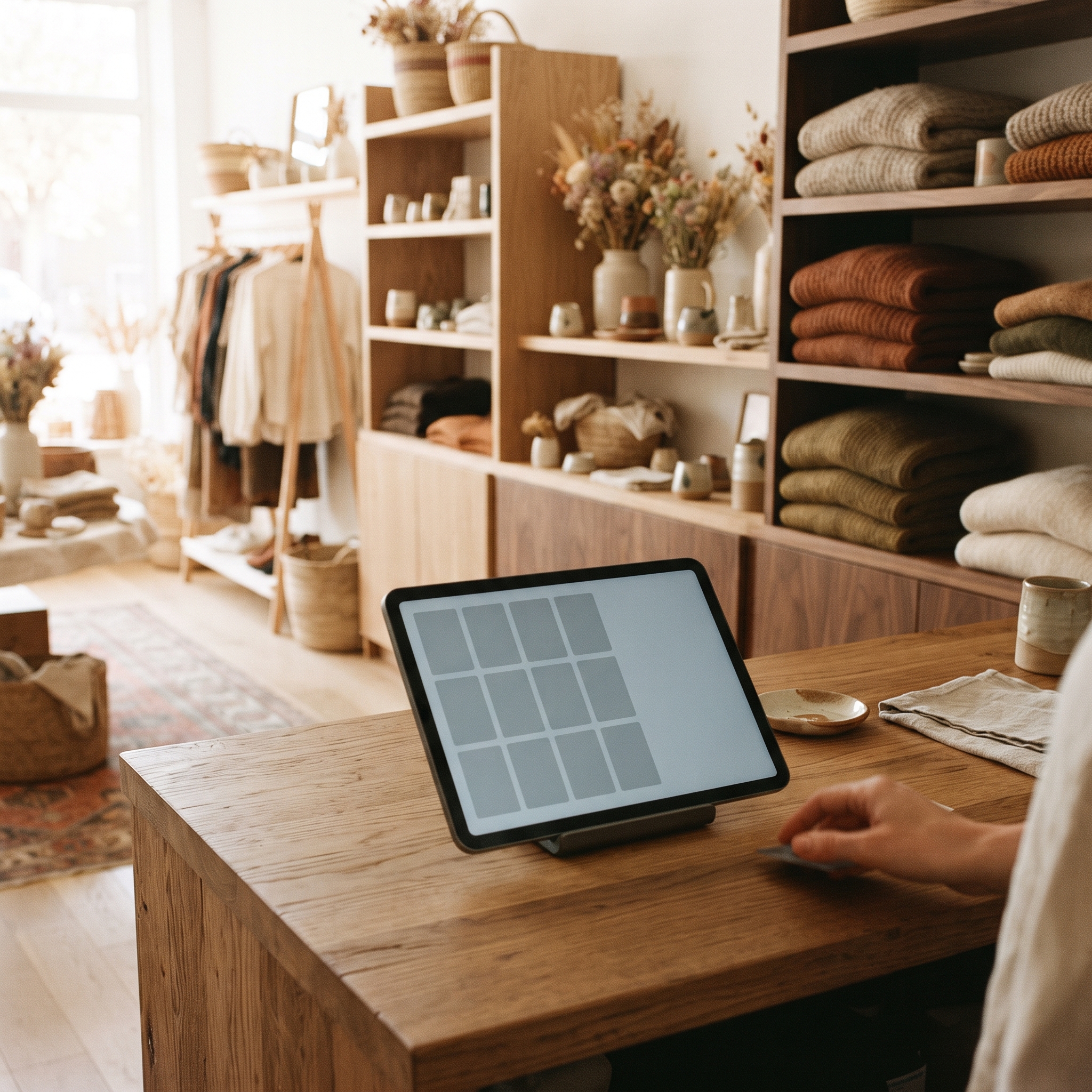
Because on legacy systems, the layout is the product. Square, Clover, and their peers ship a grid of item tiles. You can rearrange the tiles, pick from preset colors, and on some plans resize them, but the grid itself is not yours to change: same structure, same fonts, same spacing, same screen flow on every counter that runs it. Customizing it means moving blocks around inside a frame someone else drew.
That is not an oversight. One layout that works for a million merchants is cheaper to build and support than a layout each merchant can shape. The trade shows up at the counter: a candle studio, a menswear shop, and a convenience store all check out on the same gray grid.
For a boutique, that stings more than it should, because sameness is the exact thing a boutique exists to avoid. If the mismatch has been bothering you for a while, the signs you've outgrown an off-the-shelf POS usually start right here.
What does a brand-first POS layout actually change?
Four things, all visible from both sides of the counter:
Color. Buttons, backgrounds, and accents pulled from your actual brand palette, matched to your walls, bags, and labels, not the closest swatch from a preset list.
Typography. The type on screen agrees with your signage and price tags. A shop built on a warm serif should not ring up sales in a cold system font.
Hierarchy. Button sizes earn their place. Your twenty best sellers, gift wrap, and loyalty signup get big targets on the first screen; the long tail lives one tap deeper.
Flow. The screens follow how your staff sell. If every layout decision fights how the shop works, staff route around it, and workarounds quietly become the system.
None of this is decoration. The common objection is that speed matters more than looks, and it is a fair one. But a layout tuned to what you actually sell is also the faster layout: fewer taps, less scrolling, fewer mischarges. Brand-first and efficient are the same project, which is why layout sits near the top of most advice on optimizing your POS experience for retail.
Does the checkout screen really change how customers see your store?
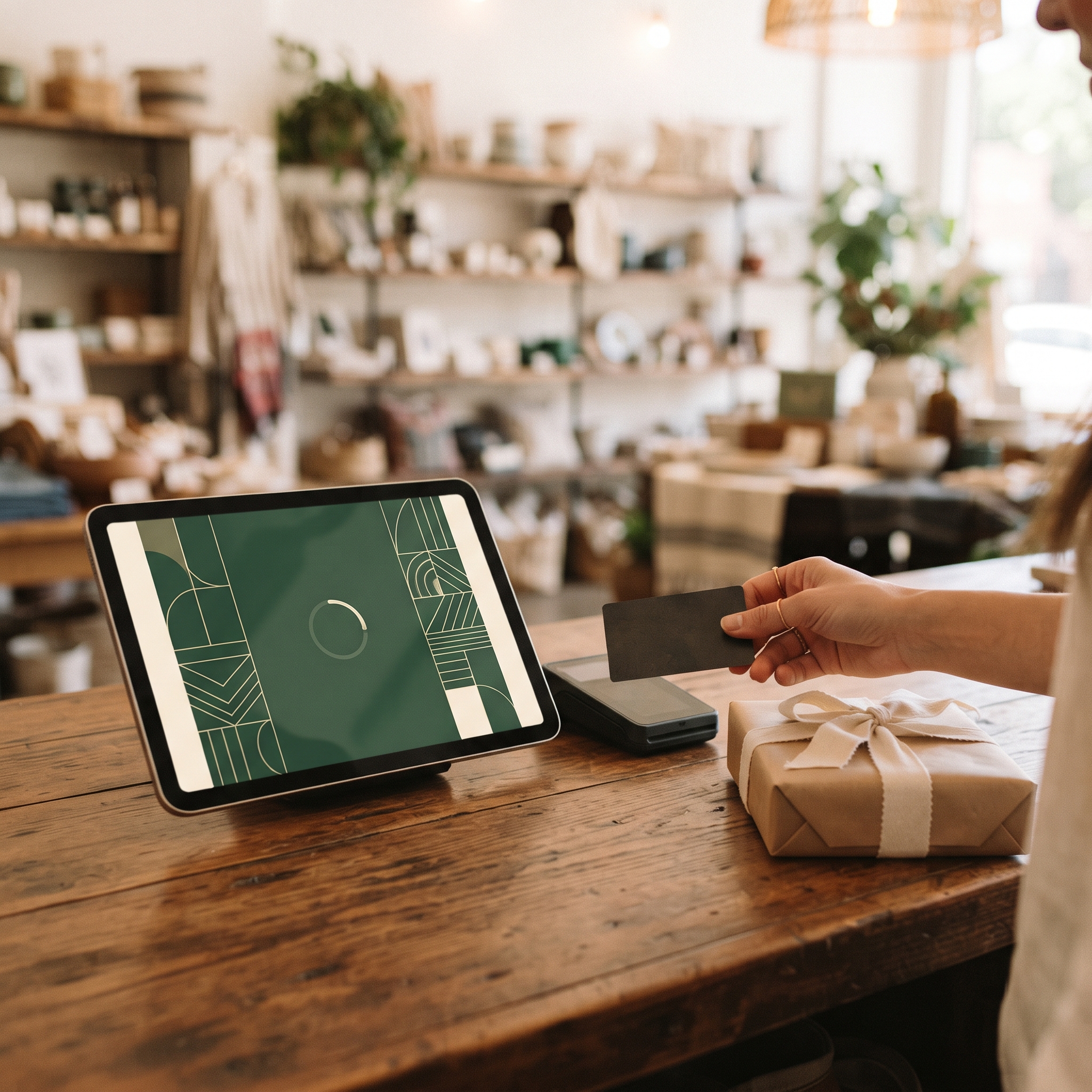
Yes, because the counter is where the visit ends and the money moves. A customer can drift past your fixtures, but at checkout their attention is pointed at a screen: the total, the tip prompt, the receipt options. That moment is also the one they replay when deciding how the purchase felt.
A curated store with a generic checkout sends a mixed signal, the retail equivalent of a beautiful restaurant handing you a gas-station receipt. A brand-matched screen does the opposite: it quietly confirms that the care extends all the way through the transaction. No slide deck stat is needed here; stand at your own counter and watch where people look while they pay.
How does conversational editing make custom layouts practical?
Until recently, a custom checkout meant custom software: an agency, a quote, and a revision cycle for every change of mind. That math never worked for a three-person shop.
Prompt-based building changes the economics. You describe the change in plain language: match the buttons to our forest green, make the top row larger, move gift cards onto the first screen, use a lighter weight for prices. The change lands in a live preview, you look at it, and you deploy it to the till or keep refining. No ticket queue, no developer, no theme marketplace of someone else's taste.
Two honest caveats. First, conversational editing covers the design layer. The money underneath, meaning totals, tax math, refunds, and card processing, has to come from real commerce infrastructure, because AI gets predictable things wrong when designing a checkout the moment it is allowed to improvise the math. Second, a custom layout is still a layout your staff learn; change it deliberately, not weekly.
This is how Build works on Final: describe the flow, refine it by chatting, deploy it to your stations, with totals, taxes, and Final Pay transactions handled by infrastructure rather than generated per prompt. If you would rather delegate the describing too, you can connect your own AI over MCP (an open standard for wiring AI tools together) and let it drive.

So, can a boutique really go beyond the grid?
Yes. The grid was never a design decision you made; it was one made for you, at a scale where your brand could not matter. A brand-first POS layout puts color, type, hierarchy, and flow back in your hands, and conversational editing shrinks the work from a software project to an evening at the counter. The rule of thumb: if your checkout screen could belong to any store on your street, it is not finished. To see what the conversational version feels like, building a first flow takes about ten minutes.
Frequently asked questions
Can you customize the checkout layout on Square or Clover?
Only within limits. You can rearrange item tiles, choose from preset colors, and on some plans resize tiles, but the grid structure, fonts, and screen flow stay fixed. A brand-first layout needs a system where the layout itself is editable.
What is a brand-first POS layout?
A checkout screen designed around your store's identity instead of a vendor's template: your brand colors, matching type treatments, button sizes that reflect what you actually sell, and a screen flow that follows how your staff work.
Do I need a developer to build a custom POS checkout?
Not anymore. Prompt-based builders let you describe changes in plain language and see them in a live preview before deploying. The money layer, meaning totals, taxes, and payments, should still come from commerce infrastructure rather than generated code.
Will a custom POS layout slow my staff down?
Done right, the opposite. A layout with your top sellers on big, well-placed buttons removes taps compared to a generic grid. Change layouts deliberately and retrain briefly, rather than tweaking weekly.
Does checkout design really affect customer perception?
Yes. The counter is the last brand touchpoint in the store, and during payment the customer's attention is on the screen. A generic checkout undercuts an otherwise curated experience; a brand-matched one quietly reinforces it.