


Receipts as Marketing: Designs That Bring Customers Back
Every paying customer walks away with a receipt, and most of them say nothing but the total. Here is how receipt design turns that ignored slip of paper into your cheapest retention channel.
 Mathias NielsenCEO, Final POS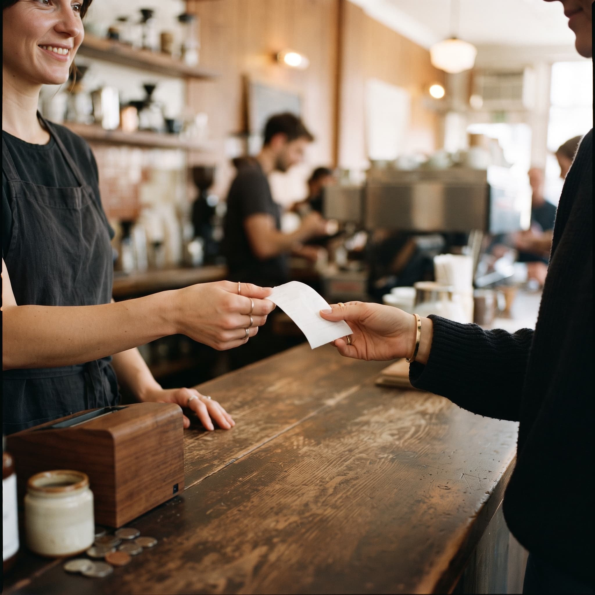
Receipts as marketing is the cheapest retention play most merchants never make. Every single paying customer gets a receipt, which makes it the only channel with 100% reach of people who have already proven they will spend money with you. The incremental cost is close to zero. And yet most receipts say nothing but a total, a tax line, and a default-font "thank you."
That is a paid-for audience walking out the door with a blank billboard in their hand.
Why is a receipt a marketing channel at all?
Because it lands exclusively with buyers, and buyers are where the money is. Bain's loyalty research found that in financial services a 5% increase in customer retention produces more than a 25% increase in profit, because return customers buy more over time, cost less to serve, and refer others¹. The industries differ; the mechanics do not. A second visit is worth far more than a first impression.
The receipt is also the last brand touch of the visit and often the only artifact that physically leaves with the customer. Your signage stays in the store. Your website requires them to remember you. The receipt rides home in a pocket.
The obvious objection: nobody reads receipts. Correct, and it does not matter. Nobody reads them like a newsletter; they glance at them for a few seconds while walking away or checking the total. Good receipt design is built for that glance: one logo, one message, one action.
What should a receipt design include to bring customers back?
Five elements earn their space. Everything else is clutter.
A reason to return, with a deadline. "10% off your next visit, valid 14 days" beats any open-ended message. The deadline is the mechanism; without it there is no reason to come back this month instead of never.
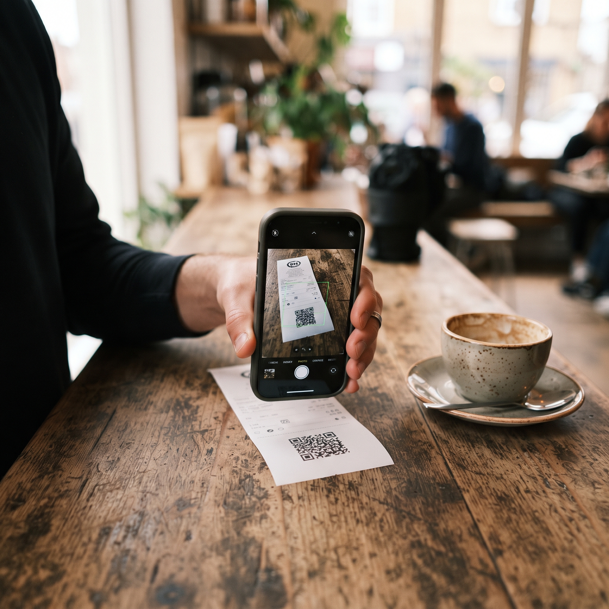
One QR code with one job. Review page, loyalty signup, or reorder link. Pick the single action that matters most and give it the whole footer. Three QR codes is the same as zero.
Your brand, recognizably. A crisp logo and a thank-you line written the way you actually talk. A receipt that looks like every other receipt markets nobody. This is the same logic behind why POS visual identity builds trust: checkout touchpoints are brand touchpoints.
A plain-language return policy. Two lines that reduce purchase anxiety do more for repeat business than a paragraph of legal text nobody parses.
White space. A cramped receipt gets binned faster. If a line does not help the glance, cut it.
The discipline is one job per receipt. The most common failure is treating the footer as a billboard for everything at once.
Are digital receipts better marketing than paper?
Different, not better. Email and text receipts belong to transactional email (the automatic messages a purchase triggers), and that category gets attention marketing email can only dream about: receipt and invoice emails see open rates around 40 to 50 percent with click-through rates of 10 to 18 percent, versus 2 to 4 percent clicks for typical marketing campaigns². Benchmarks shift year to year, so treat those figures as a snapshot as of publication.
Paper has its own strengths. It needs no email address and no opt-in, it cannot land in spam, and it physically persists: in the wallet, on the fridge, in the bag. A printed offer is a coupon; an emailed offer is a click away from archived.
The practical answer is both. Print by default, offer email or text at checkout, and never hold the line hostage while a cashier begs for an email address. A captured address is worth less than an annoyed regular.

What mistakes make receipts useless as marketing?
The failure modes are consistent across retail and hospitality:
Stale offers. A receipt promoting an expired holiday promotion signals nobody is paying attention.
Multiple competing CTAs. Review us, follow us, join the loyalty program, take a survey. The customer does none of them.
Illegible branding. A low-resolution logo on thermal paper reads as smudge, not brand.
Overlong surveys. "Answer 20 questions for a chance to win" is an ask nobody honors on a slip of paper.
Template defaults. If your receipt looks identical to the shop next door, the space is wasted no matter what it says.
Most of these are not effort problems. They are tooling problems: many POS systems ship a fixed receipt template with a logo slot and a footer line, and that is the end of it. Receipt layout is one of the seven design decisions that separate good POS systems from frustrating ones, and it belongs on the checklist when you choose a POS for retail. On Final, the receipt is an editable design surface: logos, QR codes, and dynamic data fields are laid out per format in the receipt builder, so the tactics above are settings rather than feature requests.
So, do receipts really bring customers back?
Yes, when they are designed to. A receipt with one recognizable brand mark, one time-limited reason to return, and one scannable action turns a completed sale into the opening move of the next one, at no additional cost per customer. The rule of thumb: if the last line on your receipt is the total, you paid to win a customer and skipped the follow-up. Start with the offer and the deadline; the rest is layout. When you are ready to put it into practice, the receipt builder walkthrough covers logos, QR codes, and dynamic fields step by step.
Frequently asked questions
Do customers actually read receipts?
They glance at them, they do not read them. That glance lasts a few seconds, which is enough time to register a logo, one offer, and one QR code. Receipt design that works is built for the glance, not for careful reading.
Should I print a discount offer on my receipts?
Yes, if it has a clear expiry date and it is the only offer on the receipt. An open-ended offer creates no urgency, and multiple competing offers cancel each other out. One offer, one deadline.
Are digital receipts better than paper receipts for marketing?
They serve different jobs. Digital receipts are measurable and clickable, and transactional emails get opened far more than marketing emails. Paper receipts need no opt-in and physically travel home with the customer. Offer both and let the customer choose.
What should a receipt QR code link to?
One destination with one job: a review page, a loyalty signup, or a reorder link. Pick the action that matters most to your business right now. Two or three QR codes on one receipt reliably means none of them get scanned.
Do offers on receipts cheapen a premium brand?
Only if the tone is wrong. A luxury retailer should frame the return incentive as an invitation or a private preview rather than a percentage-off coupon. The mechanics are identical; the language does the positioning.