


Checkout UX: Small Changes That Cut Seconds
The fastest checkouts run fewer steps, not better hardware. Six small checkout UX changes that cut seconds from every in-person sale, no new equipment required.
 Mathias NielsenCEO, Final POS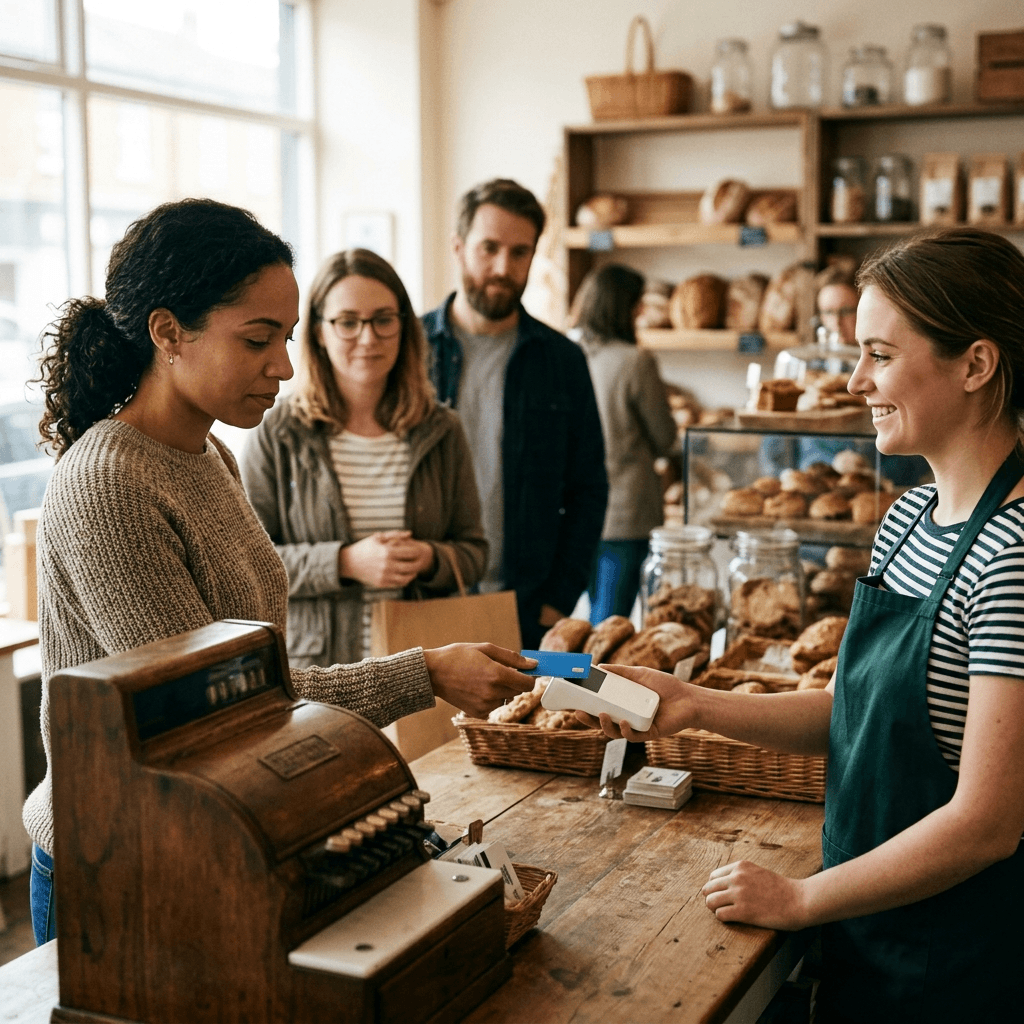
The fastest checkouts do not run on better hardware. They run on fewer steps. Checkout UX (the sequence of screens, prompts, and taps between "that's everything" and "you're all set") is where in-person sales quietly gain or lose seconds. Those seconds compound across every sale, every shift, every day.
The changes below need no new equipment. They need you to look at your checkout flow the way the customer in line does, and to cut whatever earns nothing.
Do a few seconds at checkout actually matter?
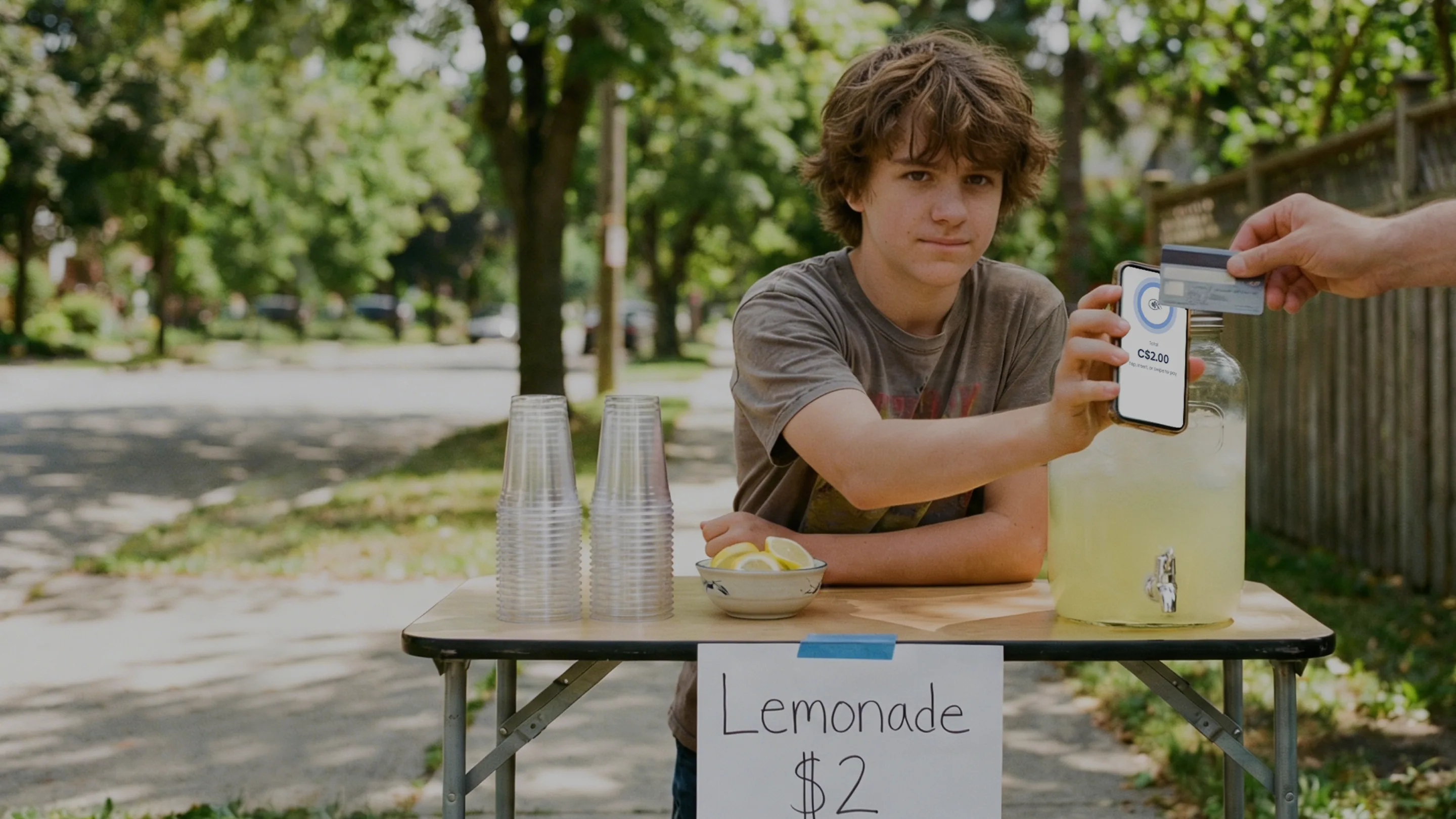
Yes, because seconds at checkout never happen once. A store running 300 transactions a day that trims 5 seconds from each one gets back 25 minutes of counter time daily. That math is an illustration, but the behavior behind it is measured: in a 2024 Waitwhile survey of 1,000 US consumers, 80% said they avoid a business when they see or expect a line, and 61% admitted they have left a line before reaching the front¹.
The line does not have to be long to cost you sales. It has to look slow. Every stalled interaction at the counter, whether a payment retry, a hunted-for product, or a prompt nobody needed, is visible to everyone standing behind it.
What is the fastest way to take a payment?
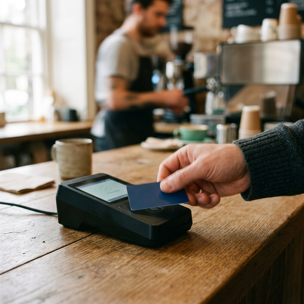
Tap first, everything else second. The US Payments Forum, the cross-industry body for American payment standards, recommends contactless (tap) acceptance because it reduces both the actual and the perceived transaction time compared with inserting a chip card².
Configure your flow so the reader prompts for tap immediately. If nearly every payment is a card, a "select payment method" screen is a step that exists for the exceptions; keep cash one tap away instead of in the default path. If you sell in Canada, in-person debit runs on Interac through certified terminals, a rail with quirks worth understanding. We covered how that works in why custom web-app checkouts fail Canadian storefronts.
How many taps does it take to ring up your best seller?
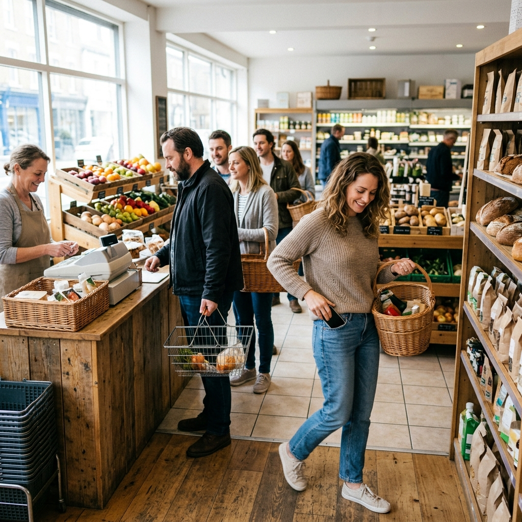
One is the right answer. If your top ten products sit under categories or behind a search box, every sale starts with a scavenger hunt while the customer watches.
Put best sellers on the first screen, ordered by real sales data rather than alphabetically. Your reports already know the ranking, and pulling it is one of the retail tasks you can hand to AI today. Barcode scanning beats typed search wherever items carry codes. Add a custom-amount button so one-off items never force staff to improvise. The mechanics of building an order fast are covered in our guide to ringing up a sale.
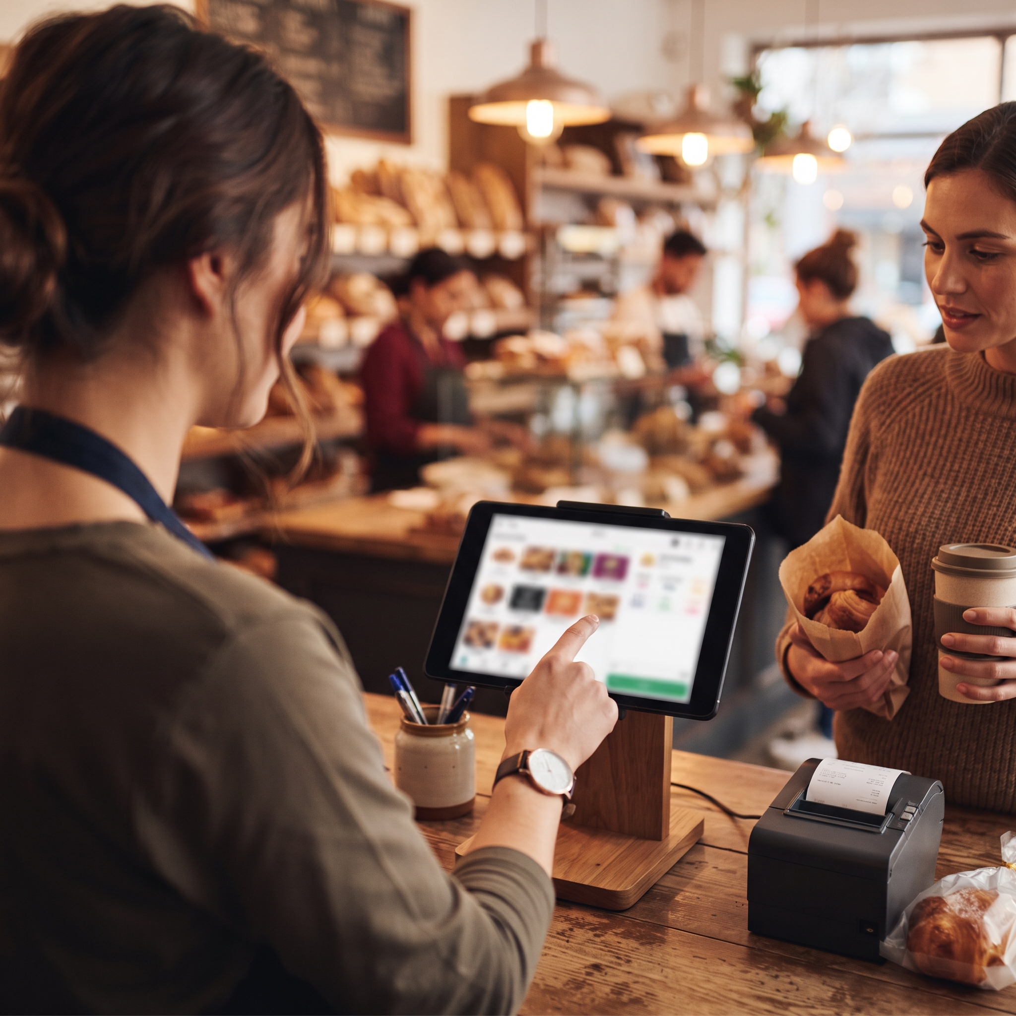
Are tip and receipt prompts slowing your line?
They are if they run as separate stops after payment. Move tipping onto the card reader so the customer answers while the terminal is already in their hand: three presets and a clear no-tip option, no nested screens. The prompt still shows on every sale. What disappears is the pause where the cashier flips a screen around and everyone watches.
Receipts should be one question with immediate options: print, email or text, or skip. Every additional receipt screen is a stall at the exact moment the sale is already done.
Which steps should you cut entirely?
Any step that changes neither what the customer pays nor what your records show. The usual suspects:
Confirmation prompts on routine actions. "Add this item?" has never saved a sale.
Mandatory customer-info fields for walk-in purchases. Collect contact details when there is a reason, not as a toll.
Discounts buried three menus deep, so staff negotiate the interface while the customer waits.
Staff switching that costs more time than it protects. Fast user switching matters more than most owners assume.
Run one shift watching only the screen. Count the taps between "that's everything" and payment, then ask what each one is for.
So which small changes cut the most seconds?
Prompt for tap first, put best sellers one tap deep, move tips onto the reader, make receipts a single question, and delete every step that changes nothing. The rule of thumb: if a step changes neither what the customer pays nor what you record, it does not belong in the flow.
The catch is that most POS systems fix the checkout sequence for you, and building your own is harder than the demo makes it look; even the newest frontier models cannot one-shot a working POS. On a flexible, prompt-based system you describe the checkout you want and deploy it, which is how Final's Build works. The walkthrough for building your first flow shows what describing a checkout in plain language actually looks like.
Frequently asked questions
What is checkout UX?
Checkout UX is the sequence of screens, prompts, and taps a cashier and customer move through to complete an in-person sale. Good checkout UX minimizes steps so the line keeps moving.
Is tap to pay really faster than inserting a card?
Yes. The US Payments Forum recommends contactless acceptance because it reduces both the actual and the perceived transaction time compared with inserting a chip card.
Will moving the tip prompt to the card reader lower tips?
The prompt still appears on every sale; it simply overlaps the payment step instead of adding one. Clear presets and a visible no-tip option keep the ask polite and quick.
How much time can checkout UX changes save?
It depends on volume. As an illustration, trimming 5 seconds per sale across 300 daily transactions returns about 25 minutes of counter time every day. The bigger win is a line that visibly keeps moving.
Do I need new hardware to speed up checkout?
No. Every change in this post is a flow change: payment prompt order, first-screen layout, tip and receipt prompts, and removed steps.